Unica
Designing the web platform launched by the Italian Ministry of Education and Merit that centralizes all tools and resources for students and families
Client
Italian Ministry of Education and Merit
Field
Education technology
Agency
Tangity
Period
Mar - Oct 2023
Role
UX
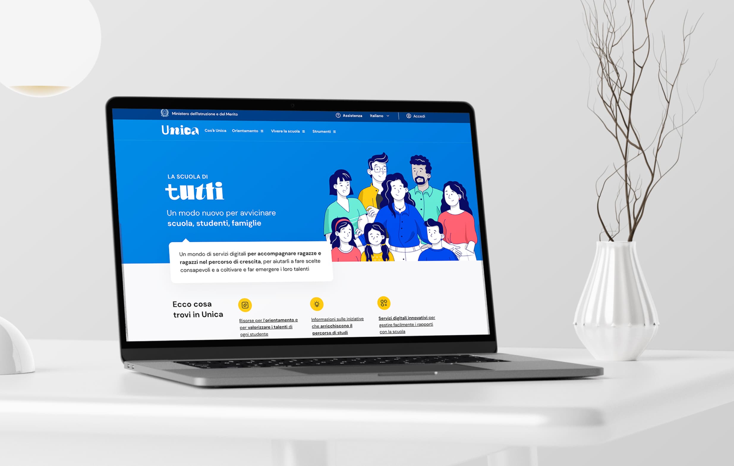
Unica is a web platform launched in 2023 by the Italian Ministry of Education and Merit. It centralizes all tools and resources for students and families.
This high-impact project delivers digital services to support students' growth, guide informed decision-making, nurture talents, and facilitate communication between schools and families.
In March 2023, I joined the UX team at Tangity (part of NTT Group) for a 6-month collaboration. Working within a well-structured team and clear requirements, we developed the platform iteratively, sprint by sprint. The platform went live in November 2023.
Project statement
The Italian Ministry of Education and Merit aimed to design and develop a platform for families and students, serving as a single access point for informational services, educational offerings, onboarding processes, and tools for guidance and service access.
Users
The platform serves over 15.5 million potential users, segmented as follows:
- 6.6 million students
- 8 million parents, delegates, or parental supervisors
- 1 million school directors and staff
Below are the key needs categorized by user type:
- Students - Access information, track academic progress, upload documents and request meeting with teachers (touchpoint: website + mobile app))
- Parents, delegates, or parental supervisors - Access school services, monitor their child’s progress, and request appointments with teachers (touchpoint: website)
- School directors and staff - Manage school calendars, classes, student records and request meetings with students and/or parents (touchpoint: website
Responsibilities
As part of the UX team, my responsibilities included:
- Analyzing requirements and outputs from the User Research team
- Creating user flows and wireframes
- Managing presentations with internal stakeholders and the client
- Collecting and integrating feedback
- Handing off designs to the UI team
- Keeping the entire team (UI, Front-End, and Back-End) informed of critical design changes
Design process
The project followed a structure of 6 design sprints, each lasting 3 weeks:
- Weeks 1-2 Analyze requirements and user research outputs to define user flows
- Weeks 3-4 Create wireframes, present them to the client, and collect and implement feedback
- Weeks 5-6 Develop the UI, present it to the client, and collect and implement feedback
At the end of each week, we held alignment meetings with the front-end and back-end teams to ensure there were no technical issues with the designs.
Scope and constraints
We had to create a digital platform for a Public Administration, which required strict adherence to accessibility standards outlined by AGID (Agency for Digital Italy) as per their official guidelines here.
Given that the public administration sector in Italy is not a tech-savvy environment, presenting the design to the client was initially challenging for the UX team. However, after the first few sprints, we refined our approach, making the presentation process smoother.
The complexity of managing vast amounts of information, features and edge cases for different user types, combined with strict deadlines, pushed the entire team to exceed their skill limits.
We maintained constant alignment between teams. The UX team ensured the UI team had the necessary information and assets for a consistent design, while keeping the development team updated on any design changes to avoid technical issues.
E-Portfolio: understanding the core features for students and families
The e-Portfolio is a digital tool that provides students, families, teachers, and school administrators with a comprehensive view of the academic and educational journey.
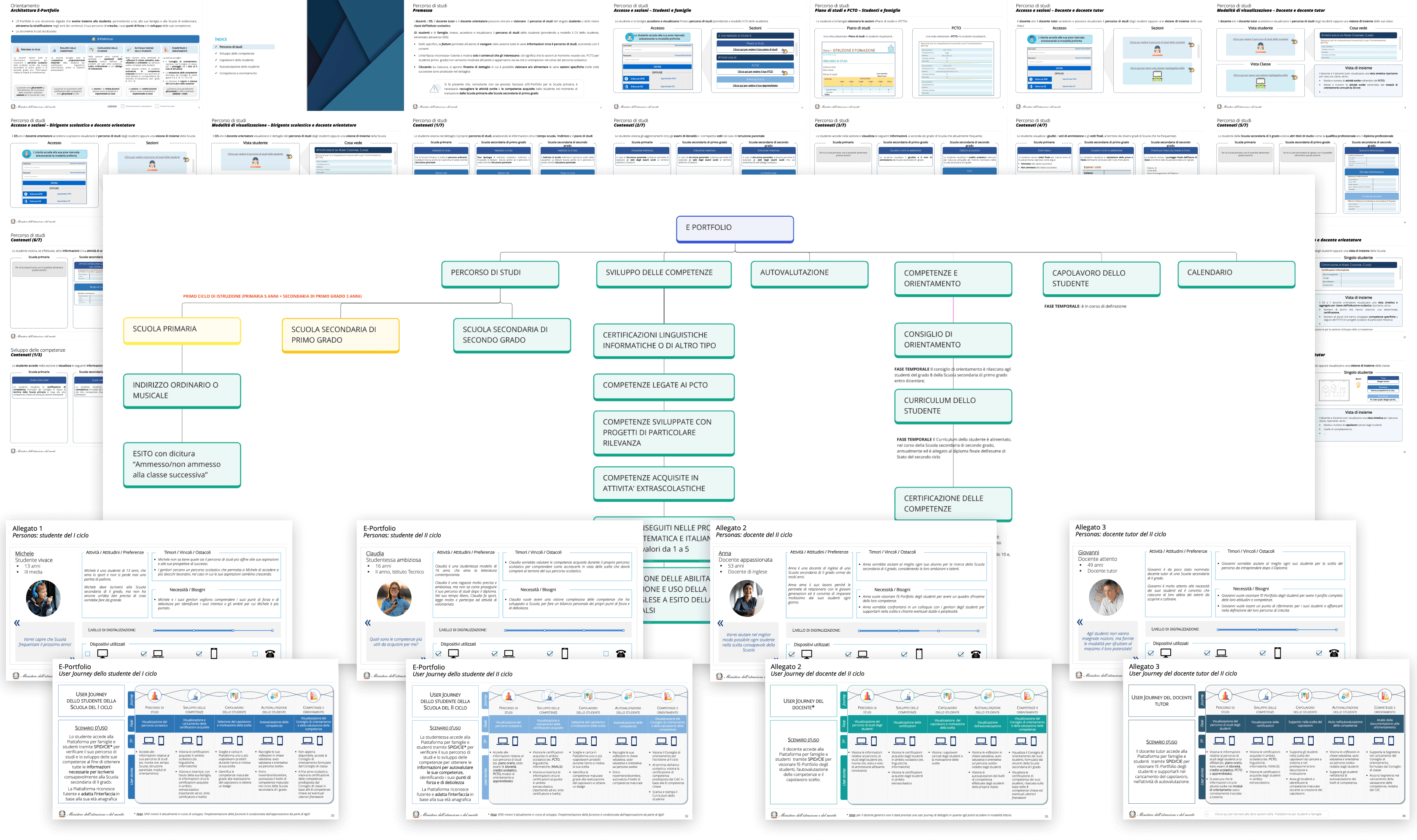
The first step before starting the wireframe design process was to study all the requirements and information related to this section of the web platform. This included information architecture, user personas, and proposed user journeys.
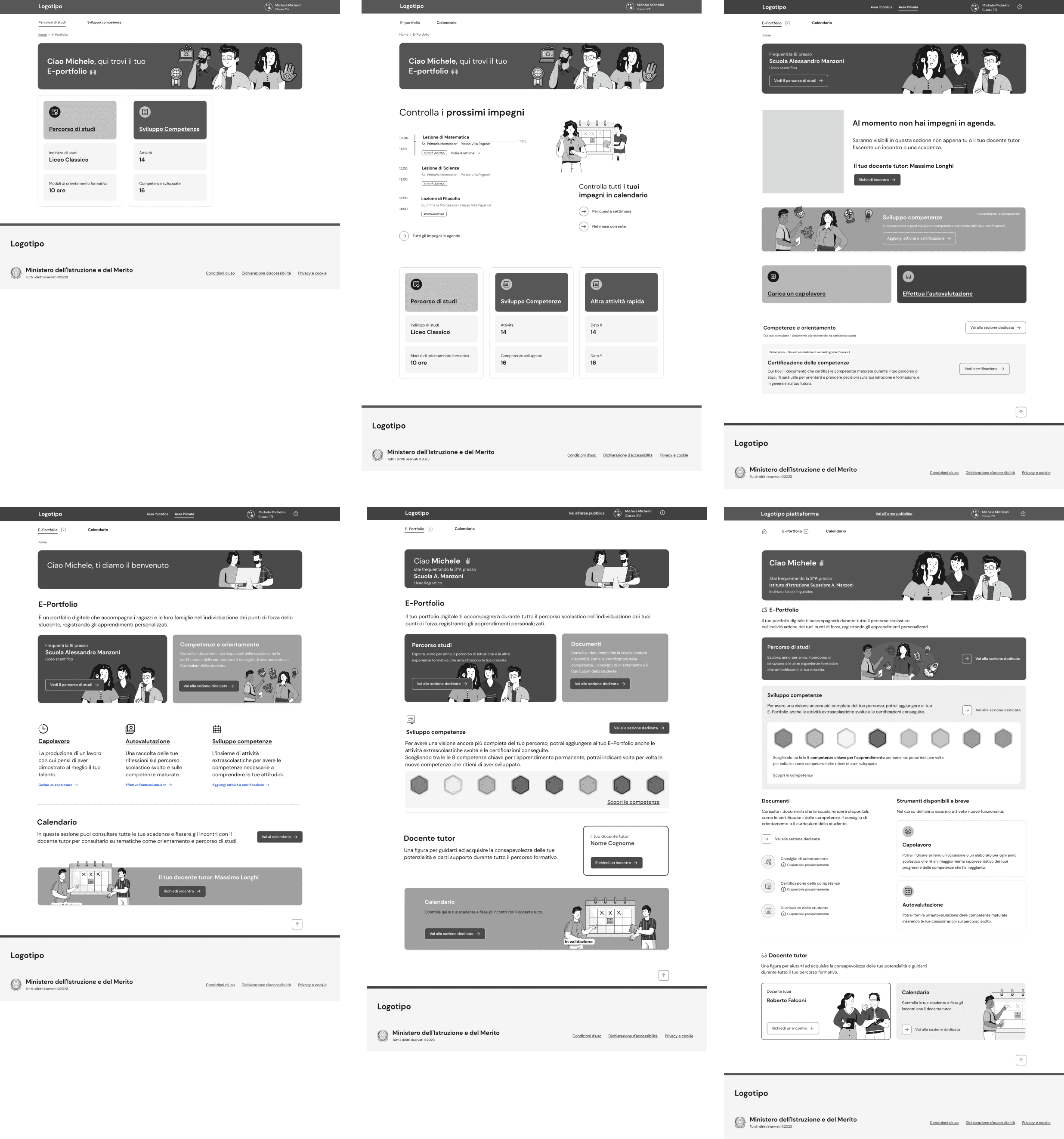
Wireframing the E-Portfolio student homepage
The homepage design evolved throughout the project as new sections and features were introduced during the design sprints.
I explored various options, using boxed representations of e-Portfolio sections to offer quick previews with relevant information for each area.
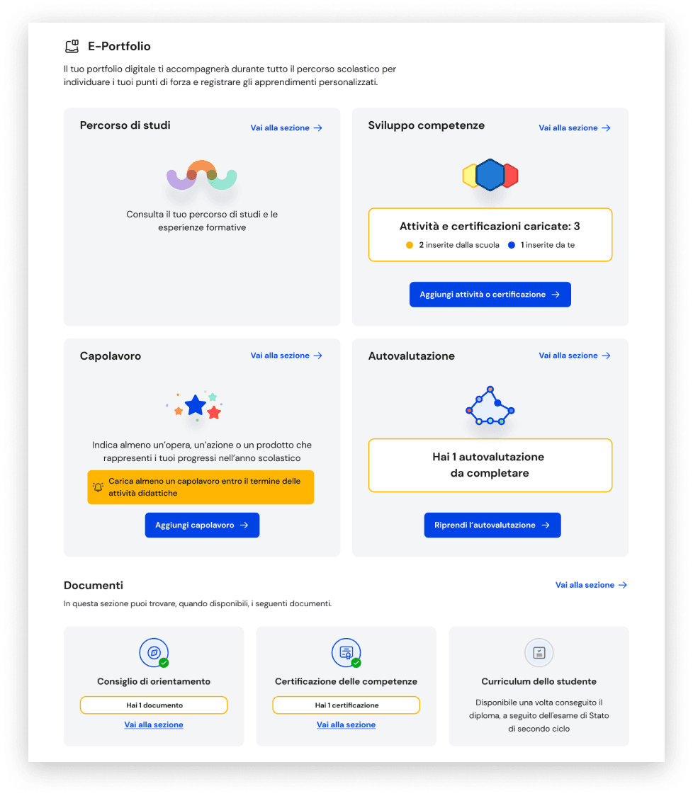
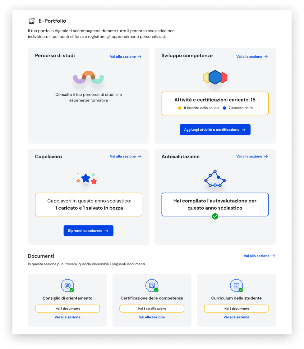
Final homepage structure with content that changes overtime
To finalize the homepage design I had to consider how the preview information in the section boxes could change overtime.
I realized a design solution that use text information to show boxes initial stated and progressive information.
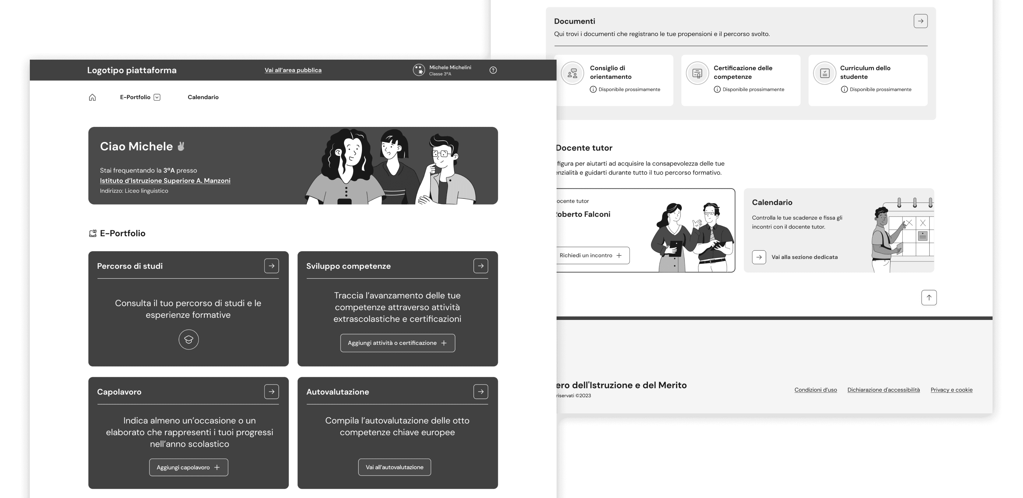
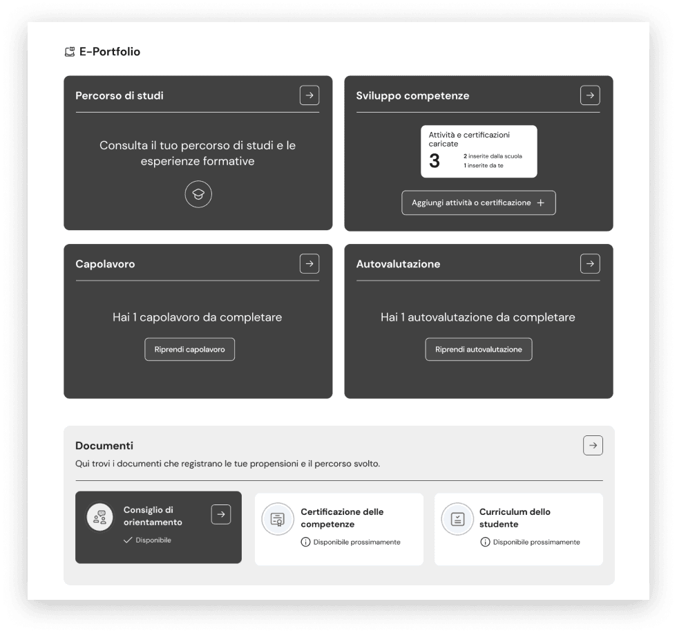
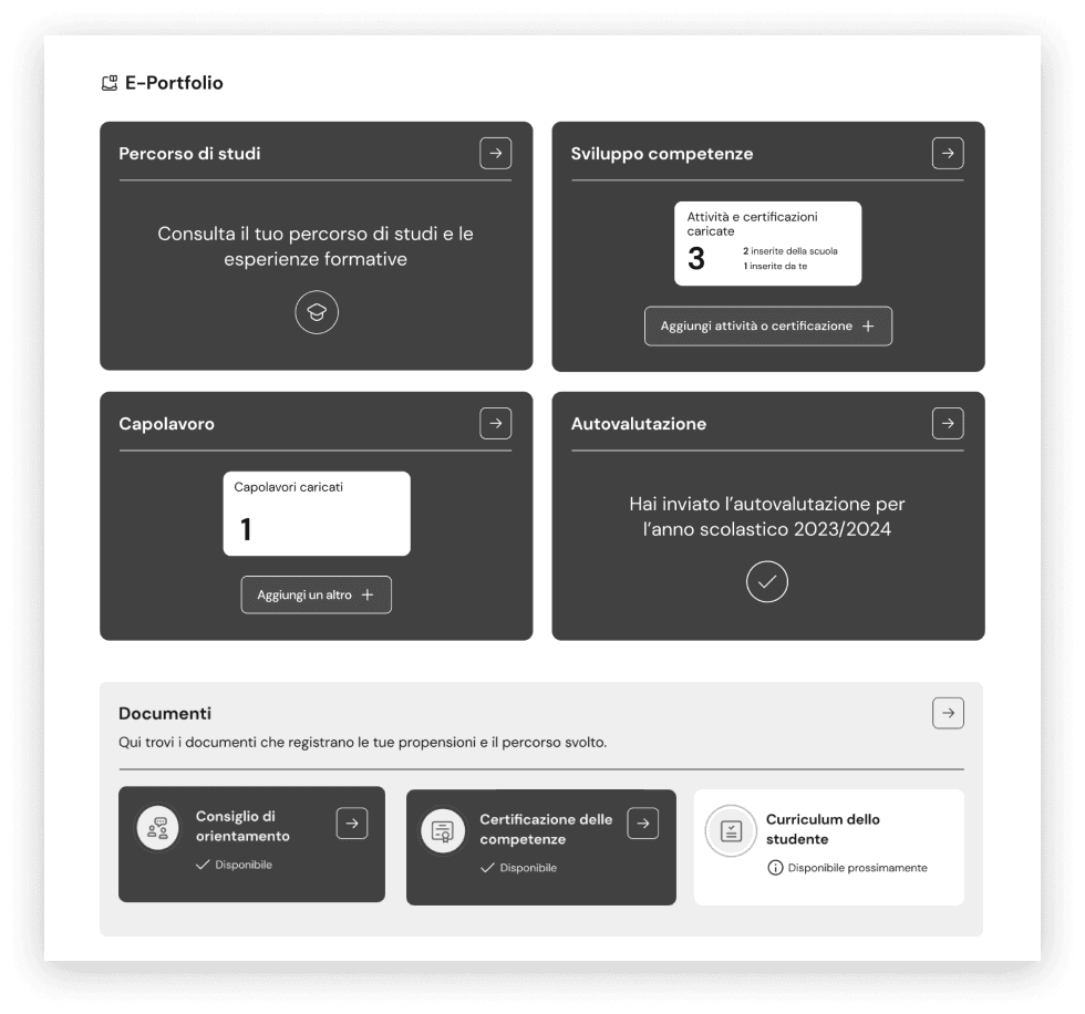
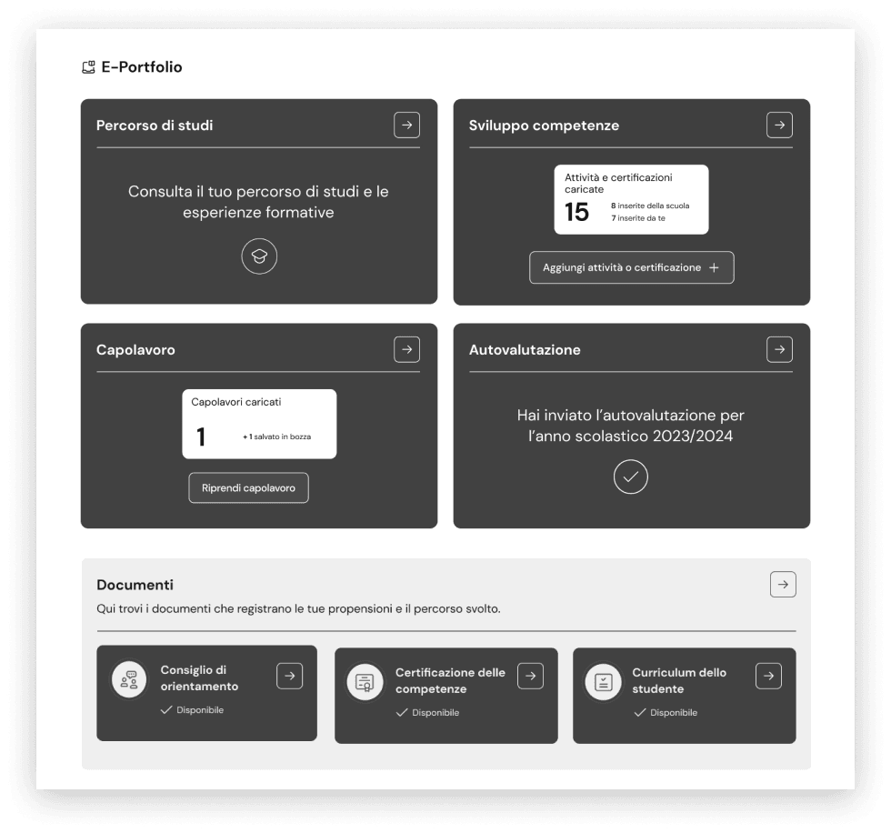
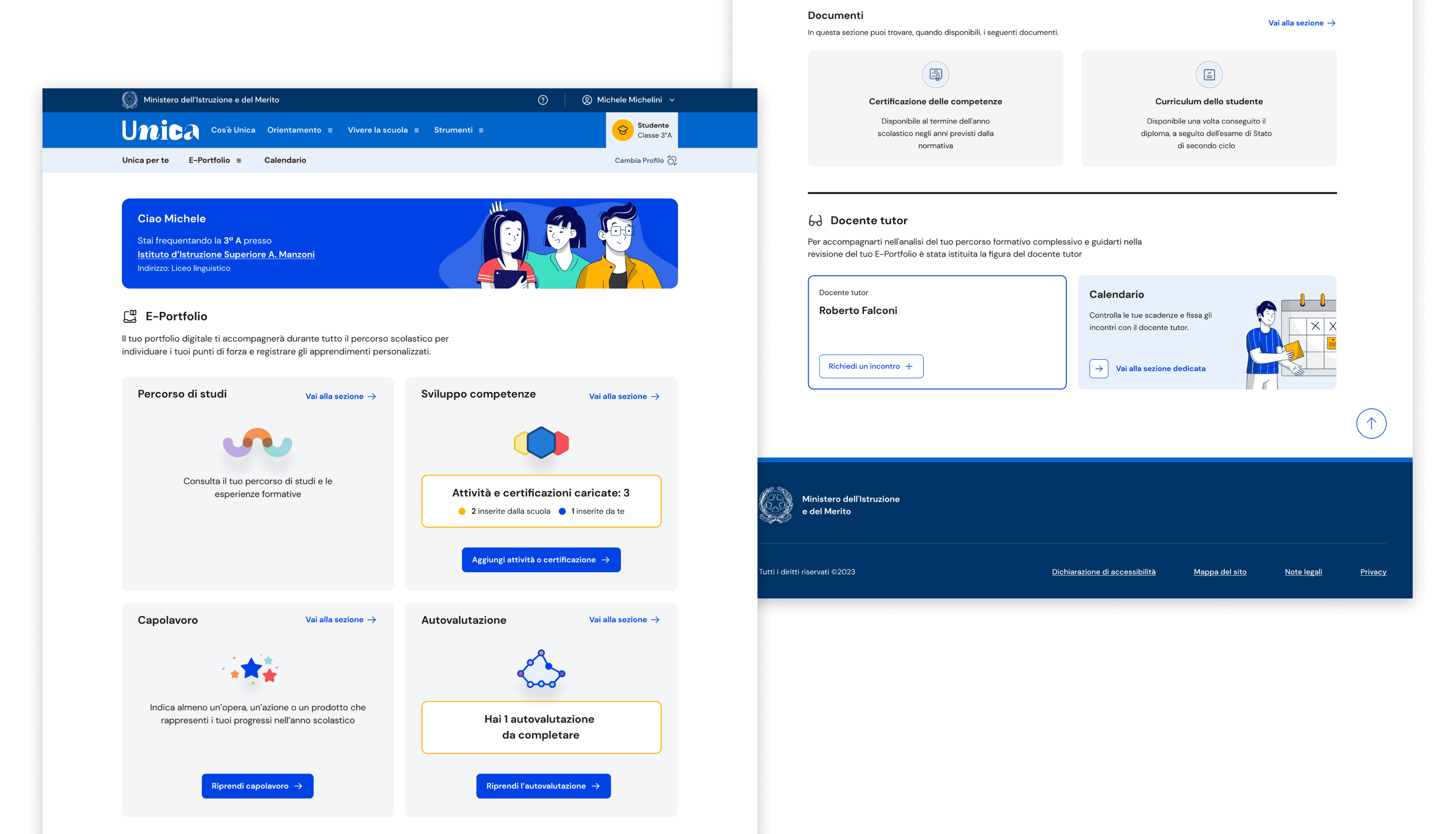
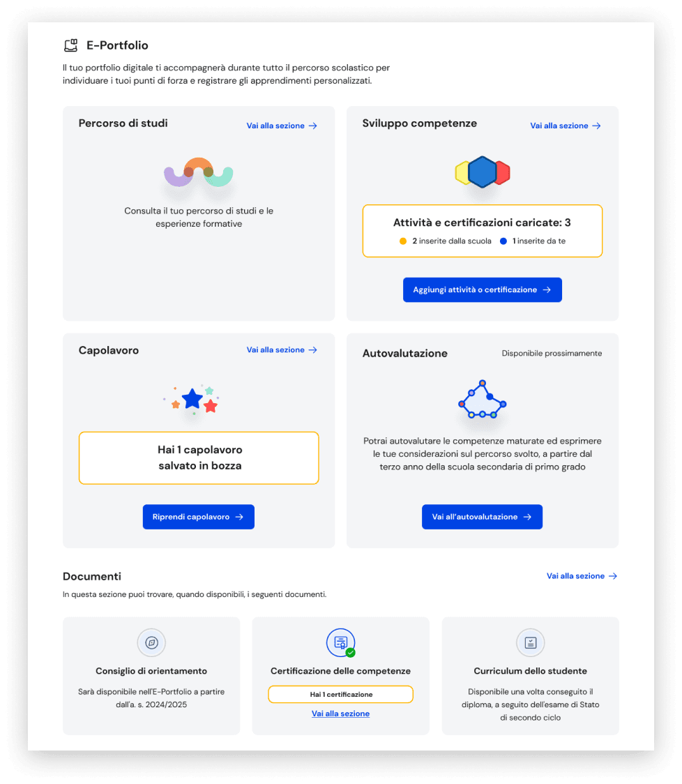
Visual of the E-Portfolio homepage designed by the UI team
The final visual created based on the wireframes I designed.
Focusing on the UX for student users across all E-Portfolio sections
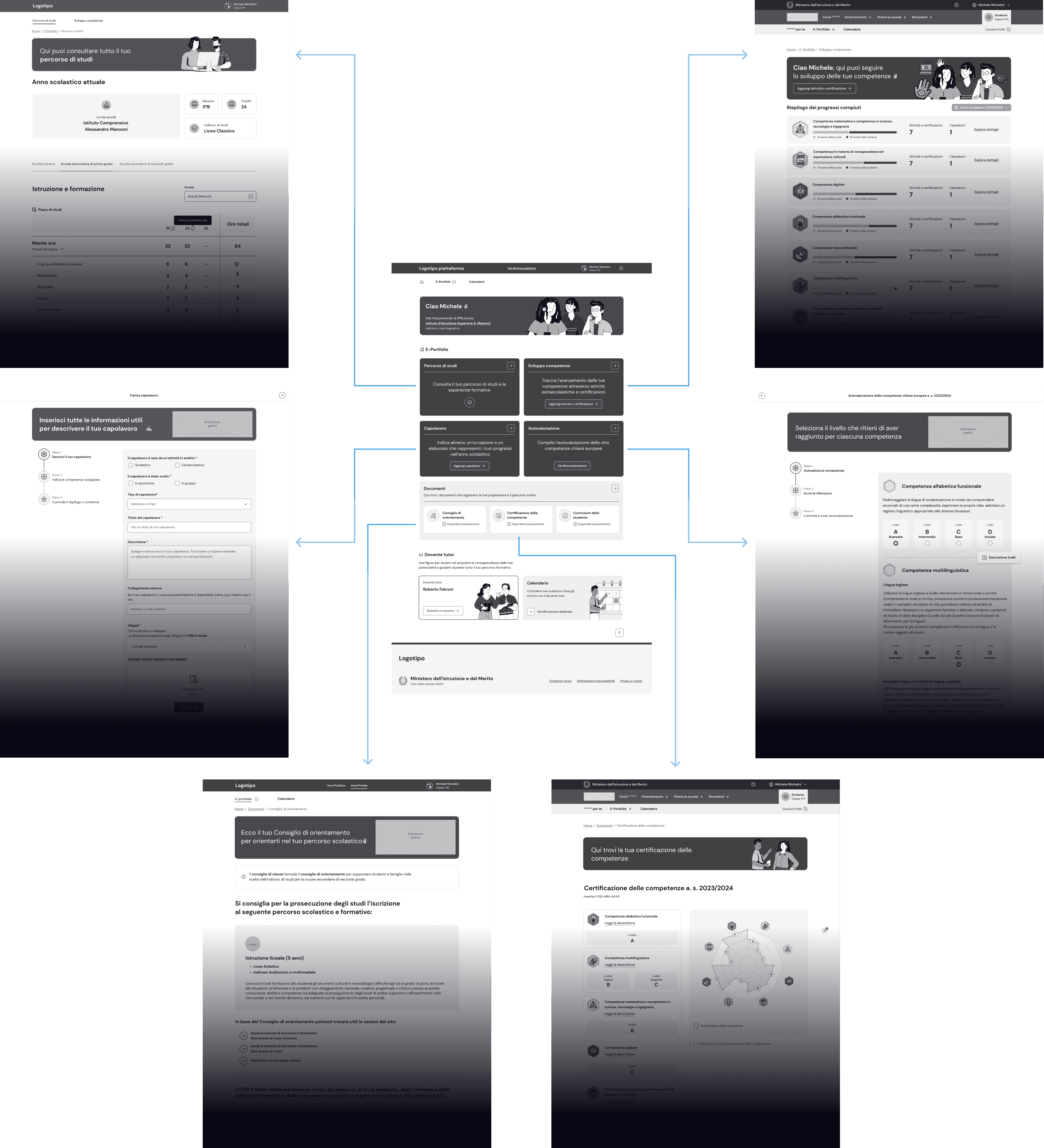
Below here graphic resume of all the sections I have been working on that students users can explore starting from the E-Portfolio homepage:
- Course of study
- Skills development
- Masterpiece
- Student Self-Assessment
- Documents
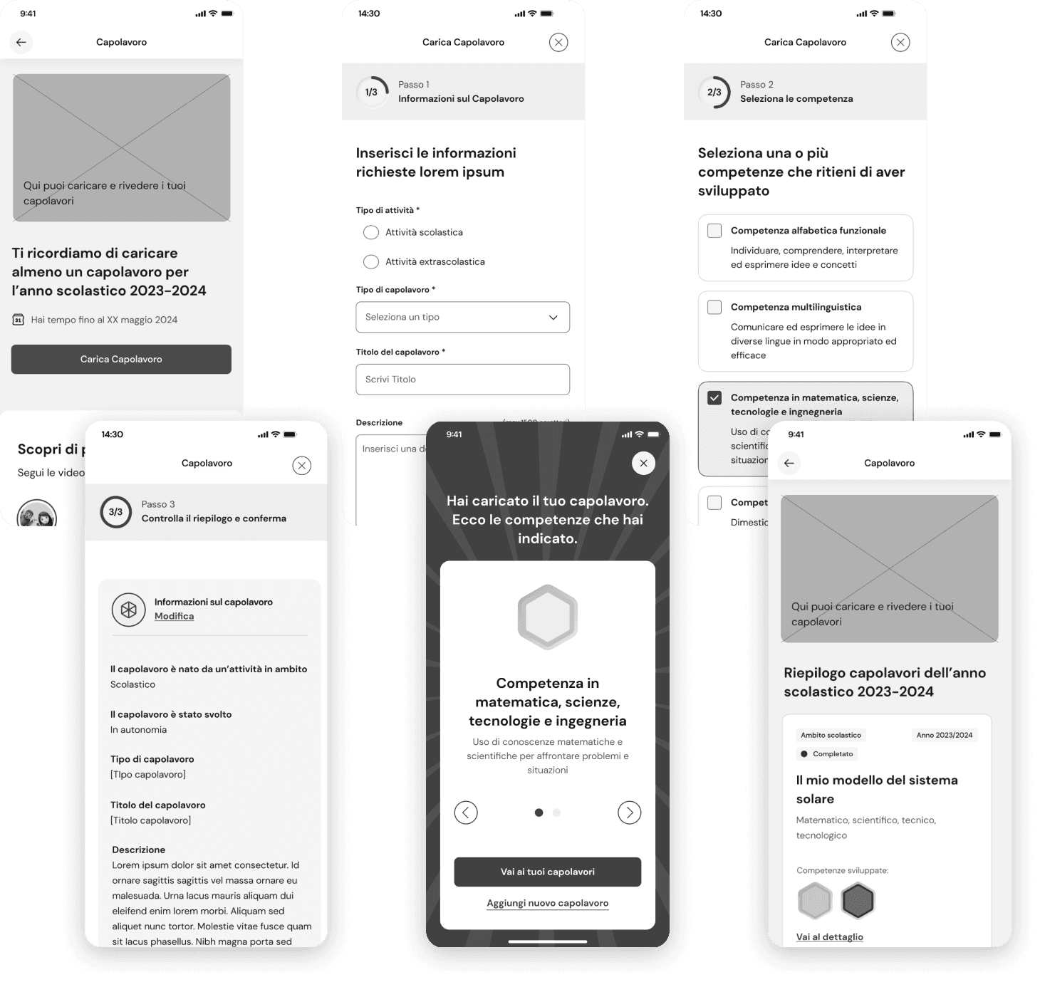
Masterpiece section: students' journey to add a masterpiece
For each school year, students can indicate one piece of work recognised as a "masterpiece" that represents their progress.
How the journey begins
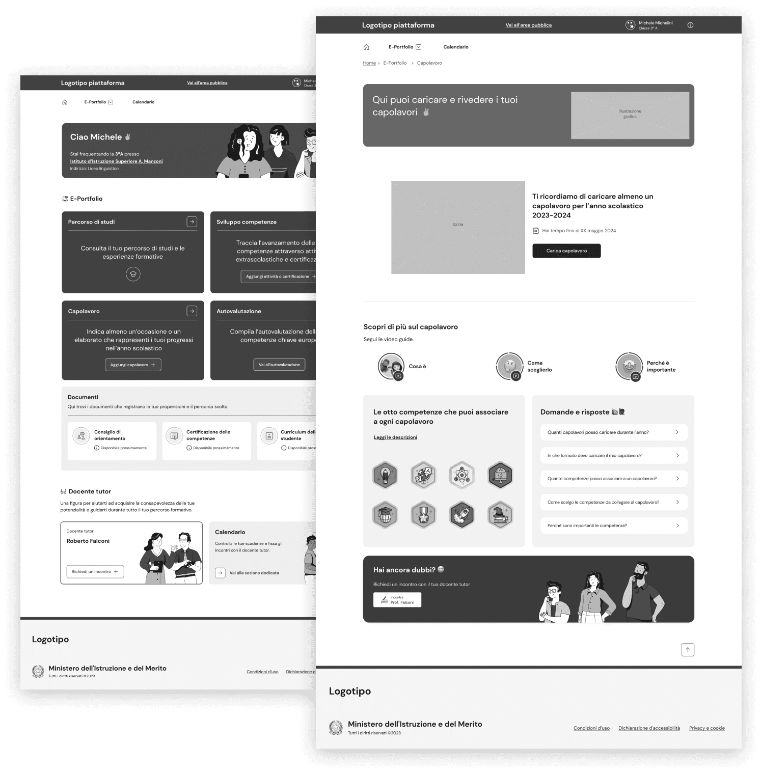
Students can access the masterpiece page from the e-Portfolio home by clicking the arrow icon button in the top right corner of the masterpiece box.
Alternatively, they can immediately begin their journey to add a new masterpiece by clicking the "Add masterpiece" CTA button.
Main steps to upload the Masterpiece
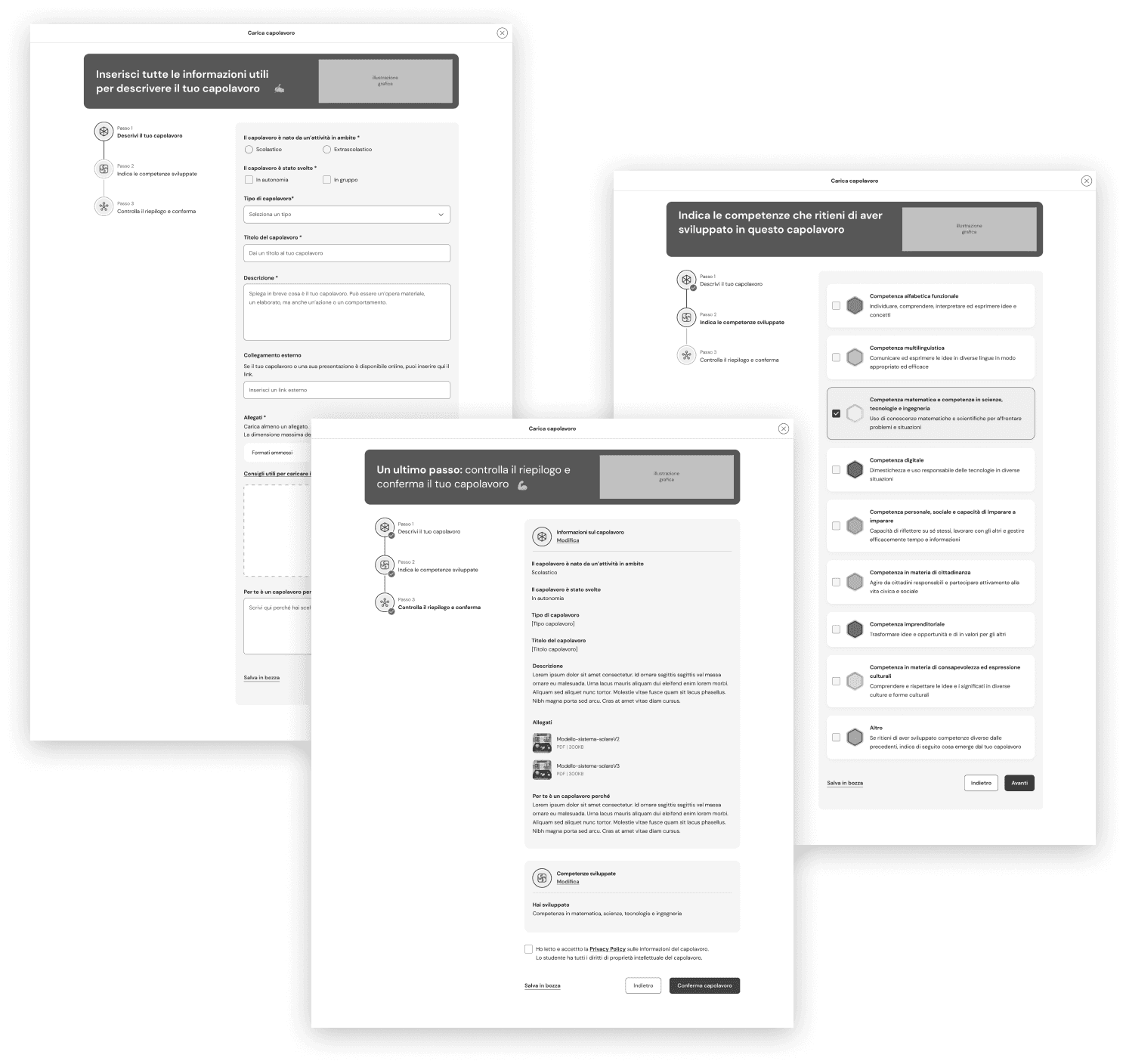
The journey is divided into three steps, where students must input all the required information to complete the process.
The main layout consists of two columns:
- Left column displays the progress through the steps with different states (in progress, done, to be done)
- Right column contains the required information input fields, a CTA text link at the bottom to save the masterpiece as a draft, along with navigation buttons for the steps
Save the Masterpiece as a draft and complete the process later
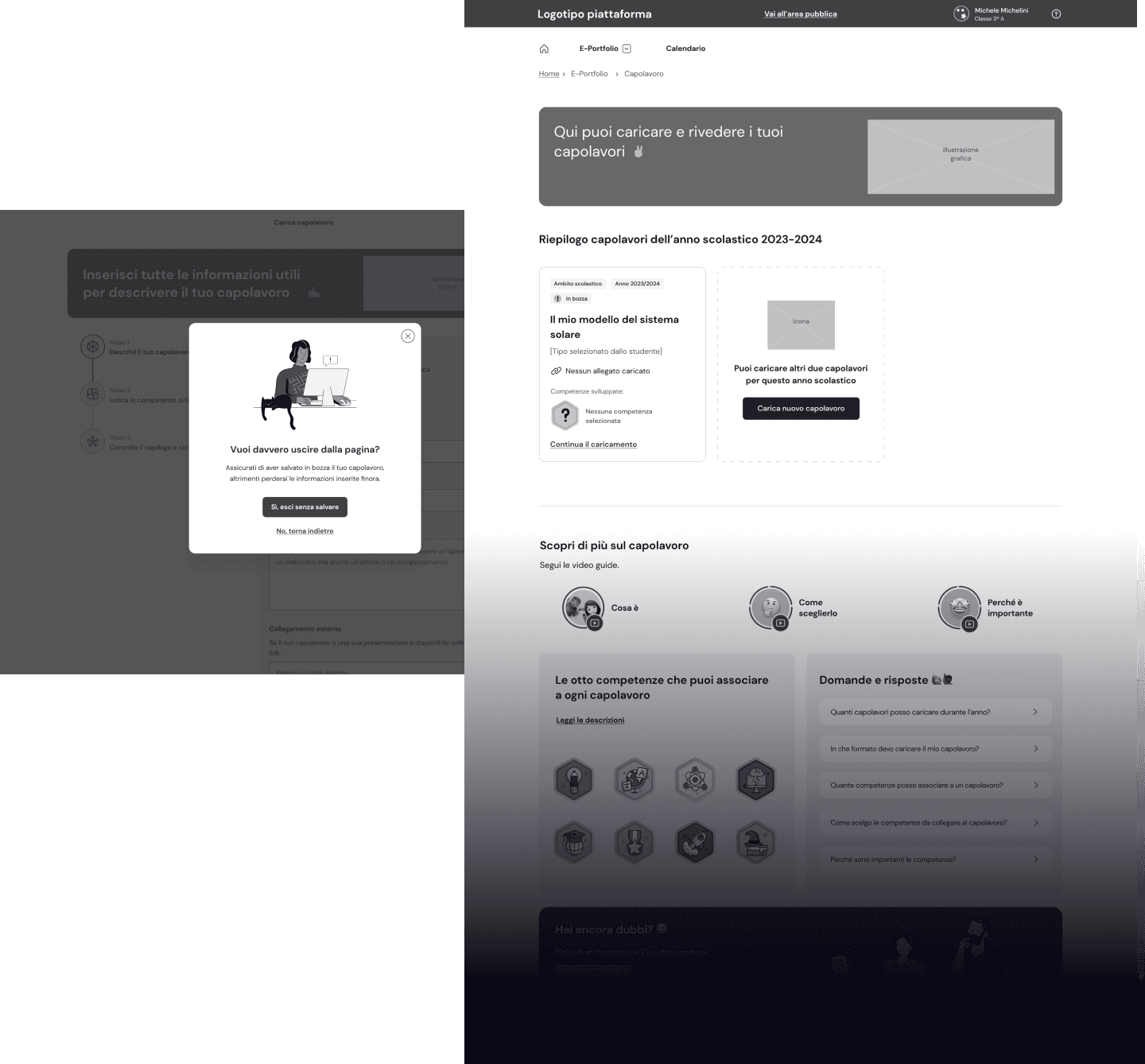
A fullscreen modal is displayed when students click the CTA to save the masterpiece as a draft or attempt to exit the journey using the X icon in the top right corner.
They can choose to save and exit (main CTA) or leave without saving (secondary CTA).
After saving, students are redirected to the masterpiece page, which has now updated its layout:
- the masterpiece preview is presented as a card element in tis draft state, summarizing relevant information and including a CTA to finalize the process
- to add a new masterpiece, I designed a separate card with a different treatment and a CTA to initiate a new process
Complete the process and return to the Masterpiece section
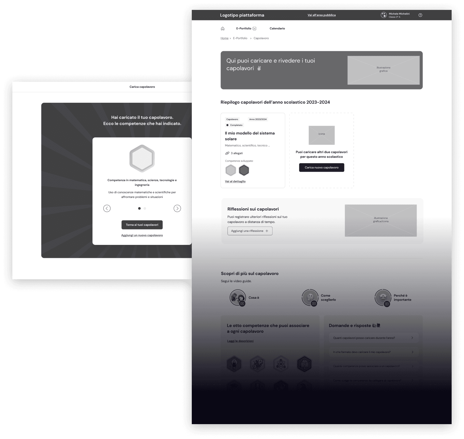
After completing the process, students are directed to a success page that displays the skill badges earned for their work on the masterpiece.
Students can then return to the Masterpiece page, where the updated layout now shows the masterpiece card element in its completed state.
Below the cards, an additional section has been added for students to post a reflection on the masterpiece, along with a CTA that initiates the related journey.
Designing the user journey for the mobile app version
As mentioned in the case study overview, in addition to the desktop touchpoint, student users also have access to a mobile app for managing all E-Portfolio sections.
I designed the mobile version of the journey presented earlier, adapting layout elements such as the step progress to improve the user experience on mobile devices.
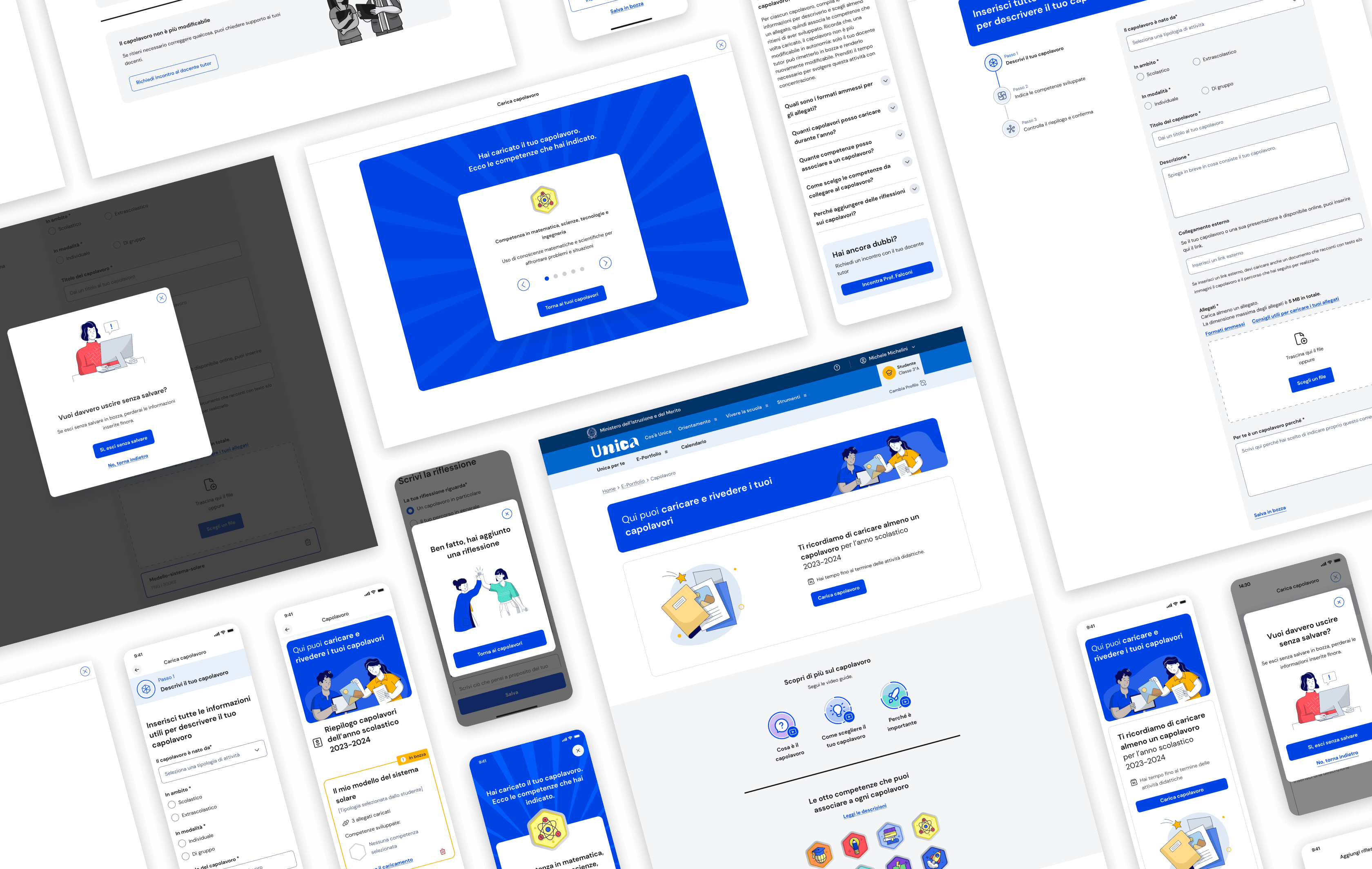
Visuals of the Masterpiece section for students, designed by the UI team
A selection of the final visuals created based on the wireframes I designed.
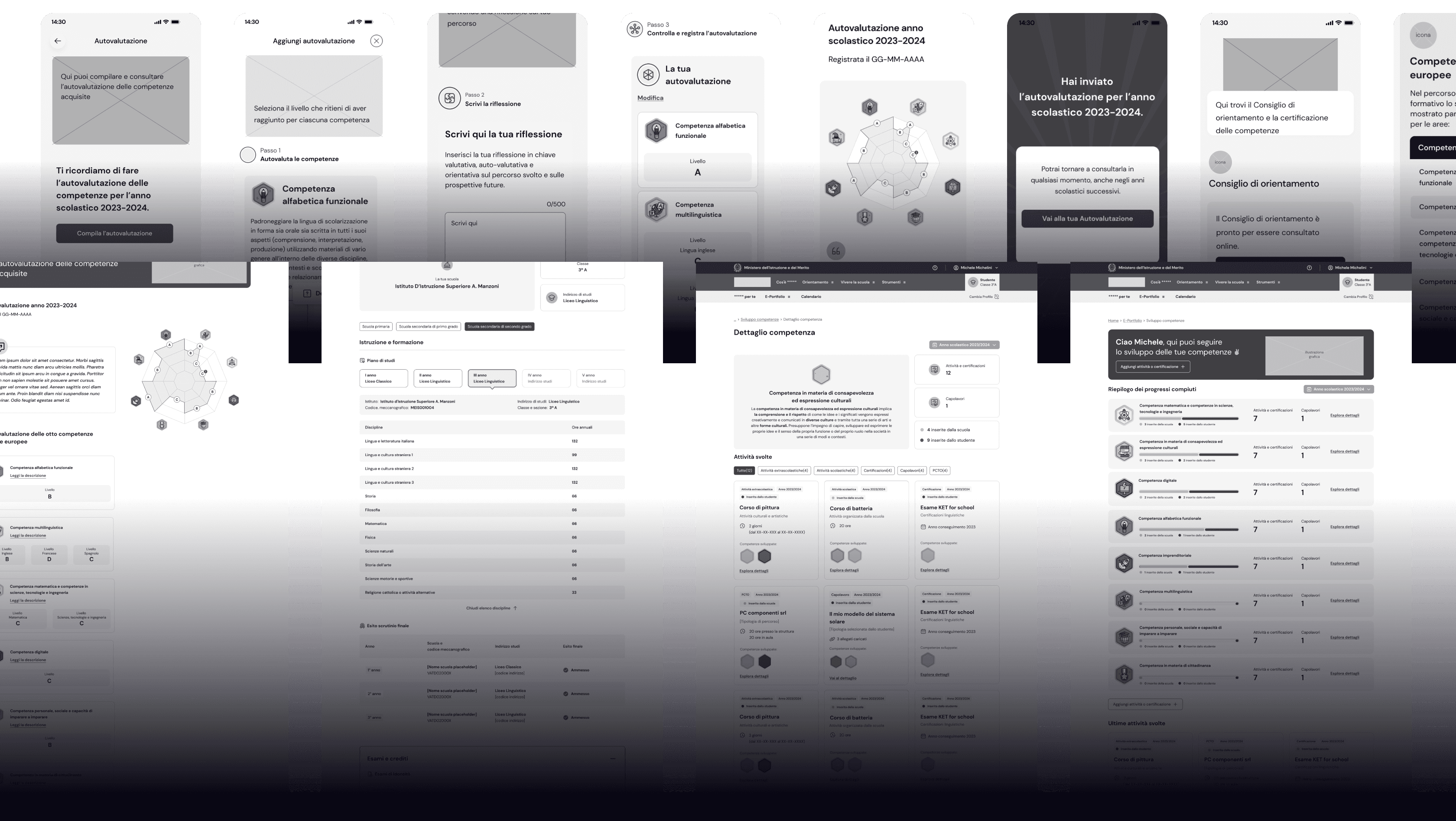
Wireframing the other E-Portfolio sections for student users, including all associated journeys
I have been working on the entire E-Portfolio, designing all user journeys for students.
Each section had specific requirements and features that needed to be considered in the design decisions.
Below is a quick overview of the mobile app and desktop versions of the other E-Portfolio sections.
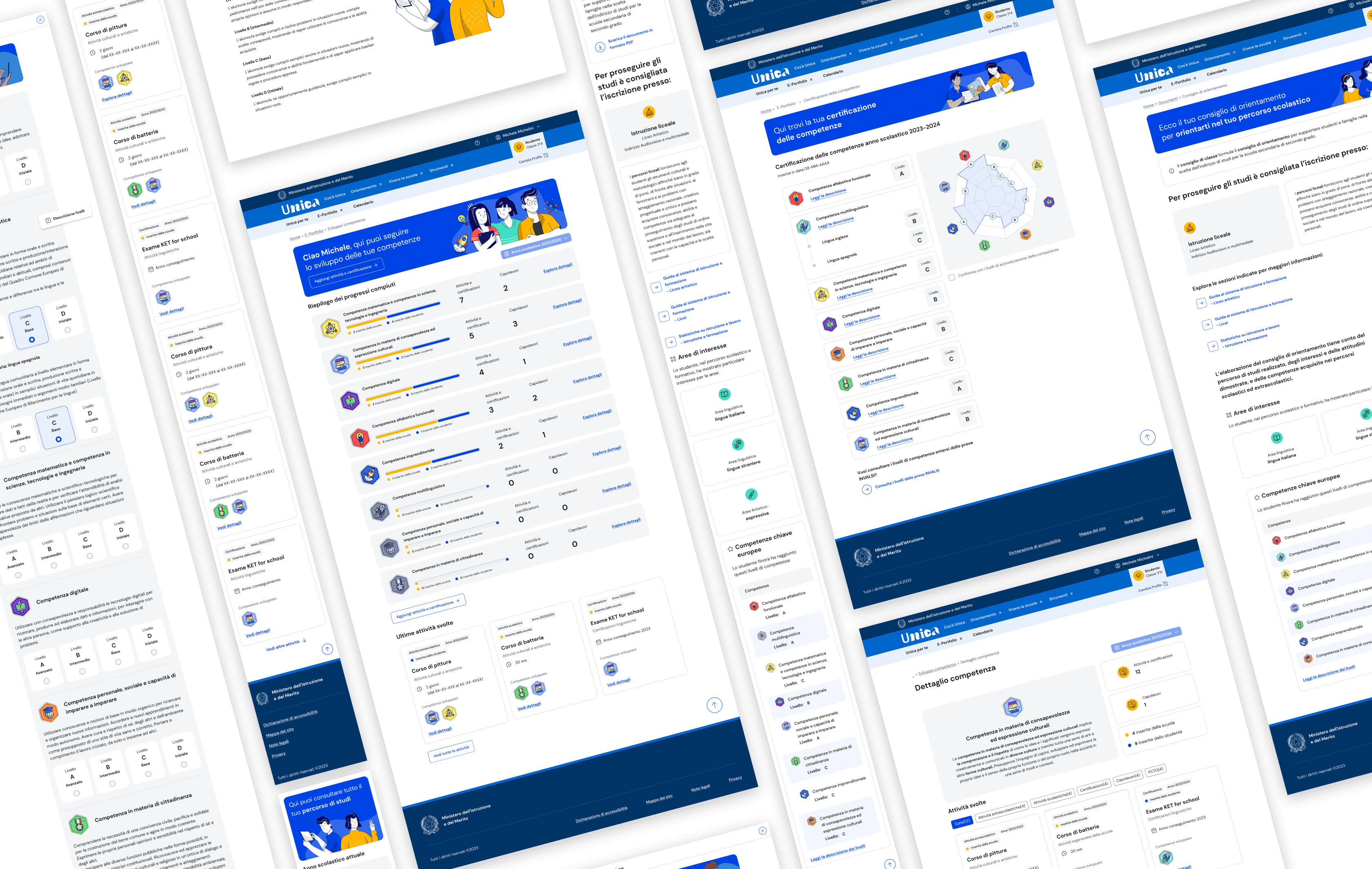
Visuals of E-Portfolio sections for students designed by the UI team
A selection of the final visuals created based on the wireframes I designed.
Defining E-Portfolio sections and journeys for other user types
The E-Portfolio serves as the core area for student users, but other user types can also access the information contained within this section.
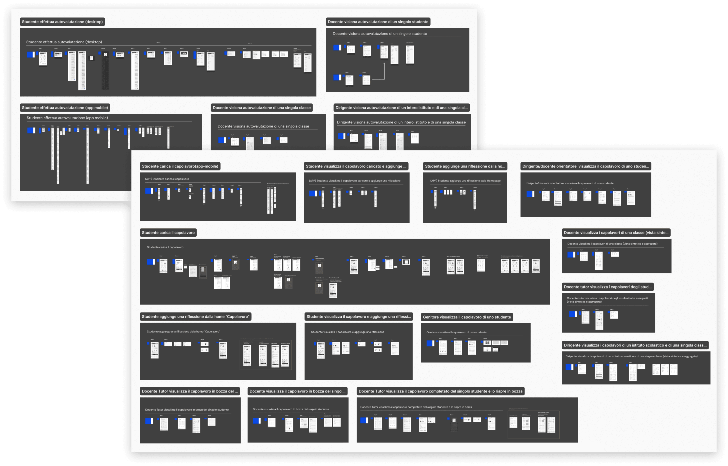
I designed the wireframes for every section and journey related to the E-Portfolio for the adult users, resulting in over 100 designed pages.
To give you an idea, below are a couple of screenshots showing all the pages I created for just two sections: Student Self-Assessment and Masterpiece.
Designing public pages with extensive data such as education and work statistics
A part from the E-Portfolio, I was involved even on the creation of pages for the public website with a huge amount of data to cominuticate like the Statistics on education and work page.
Analyzing requirements and optimizing content organization
After delving into the specific requirements for this section, I proposed a more effective content organization that reflects the progressive growth of students from school to work. The structure is composed of 3 main areas:
- Education and training
- From studying to working
- The world of work
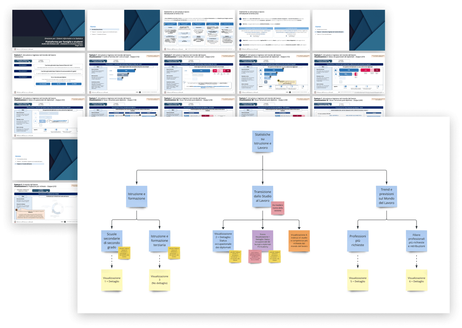
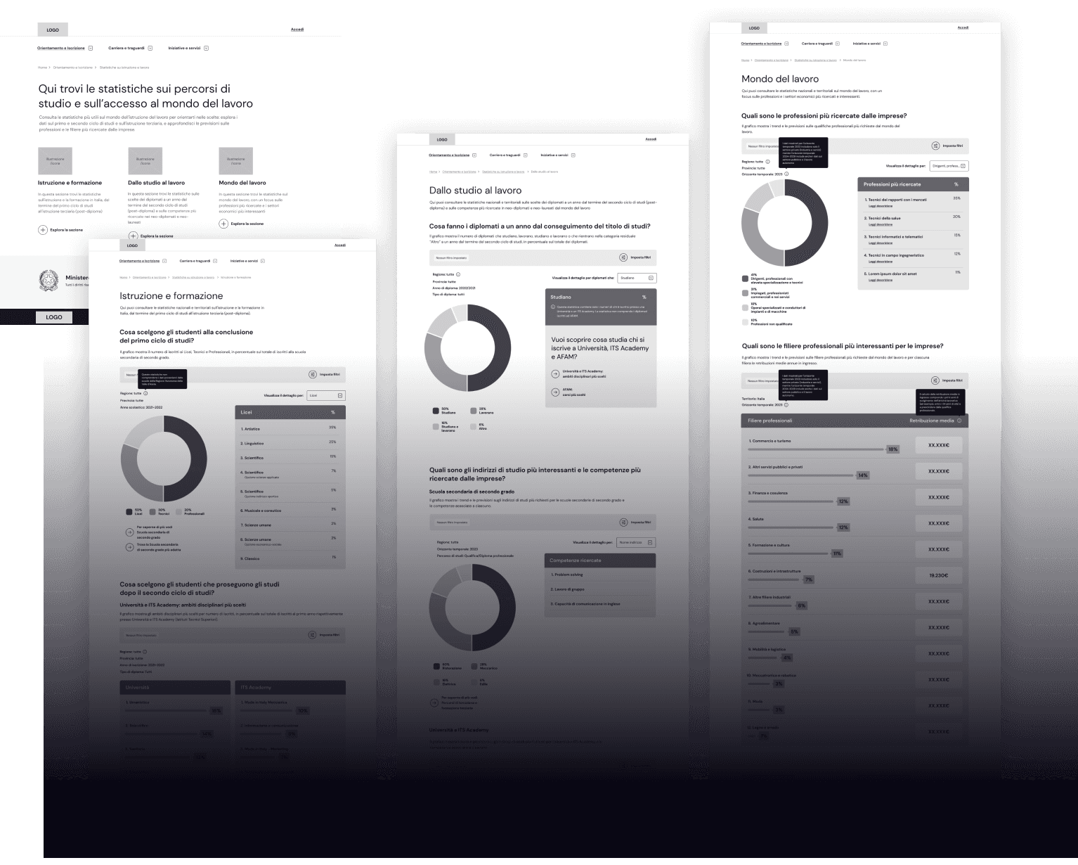
Structure of data visualizations in the main areas of Statistics
Users can access the Statistics page through the main menu. After landing, a summary of each main area is displayed, along with CTAs to explore them further.
Each area contains multiple data visualizations, which are structured as follows:
- Title and short description of the view
- Filters
- Main data visualization (donut chart, tables, progress bars)
- Useful links (if applicable)
Helping users in understanding how to read and navigate the data
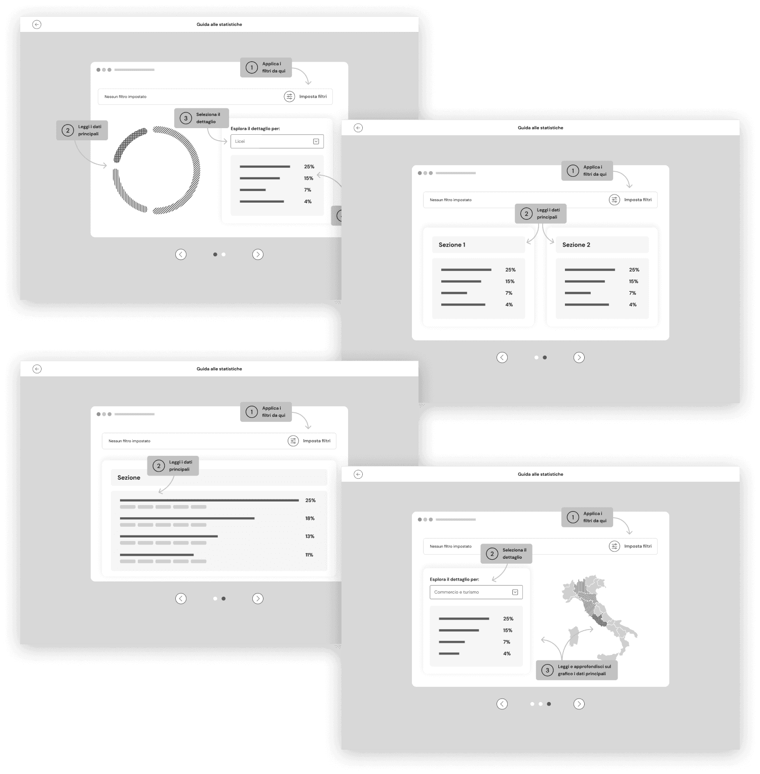
Considering the complexity of these pages, which contain vast amounts of information and multiple filters, I created a simple visual guide to assist users in interpreting the data.
Users can access the guide through the fixed CTA “Guide to Statistics” located in the bottom right corner of each main area page.
The guide is presented as a fullscreen slideshow that shows, based on the area the user is navigating, how to read the data. It explains the location of filters, key data points, and additional details.
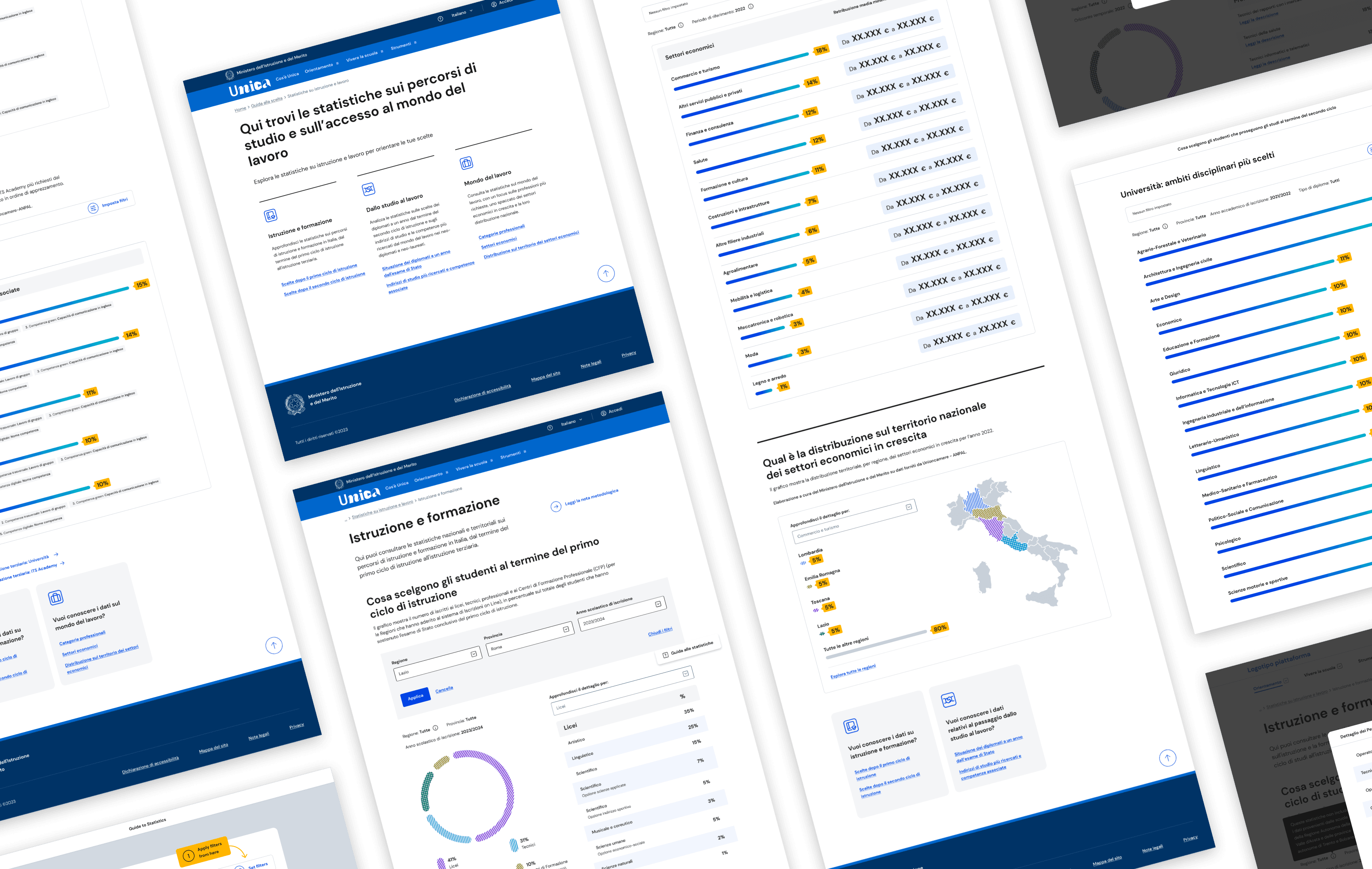
Visuals of Statistics on education and work designed by the UI team
A selection of the final visuals created based on the wireframes I designed.
Managing stakeholder presentations and updating the visual library for further review
I was responsible for presenting the user journeys I had developed, as well as the final interfaces created by the UI team for those journeys.
The presentation assets consist of:
- Cover with main objective of the journey
- Storytelling frame with explanation of the related user action for each step
- Wireframe or UI of the page
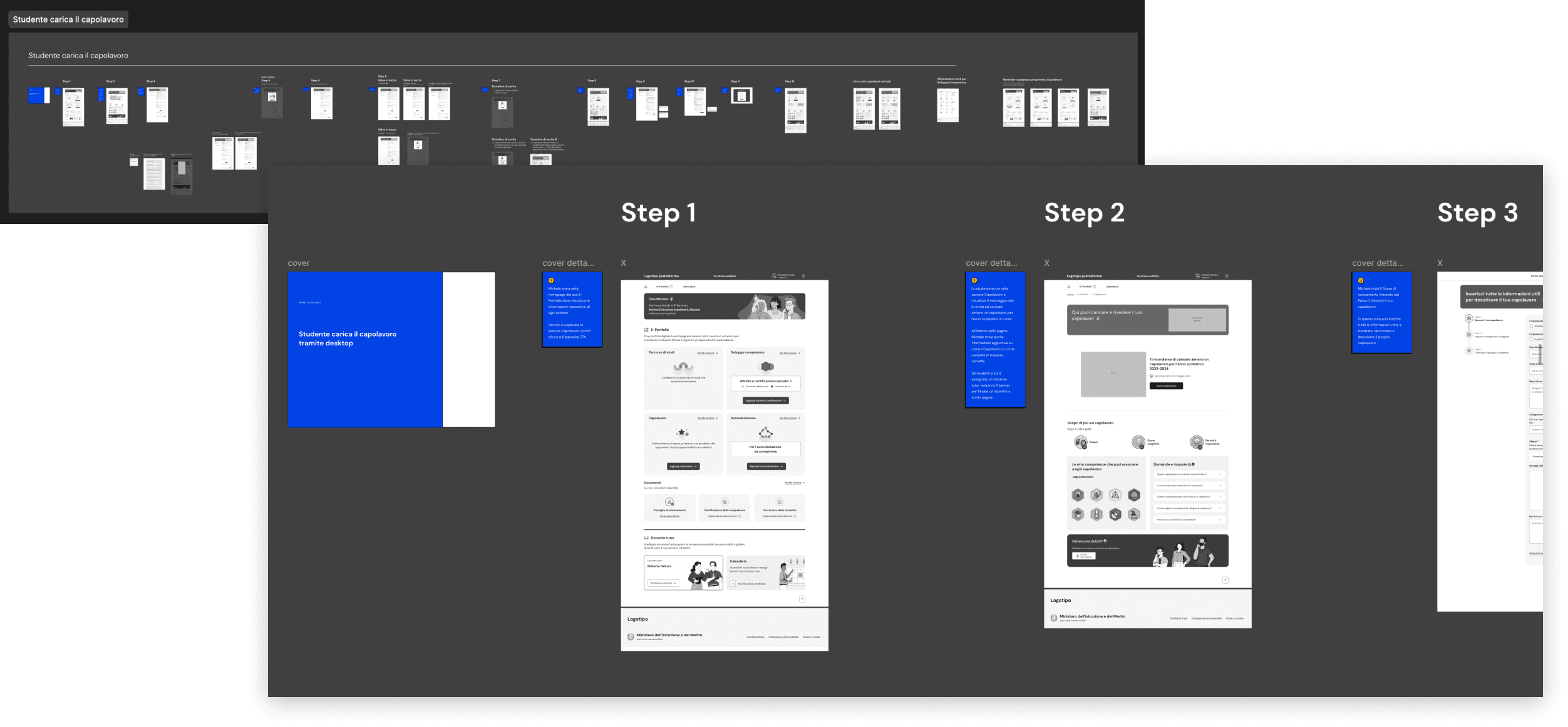
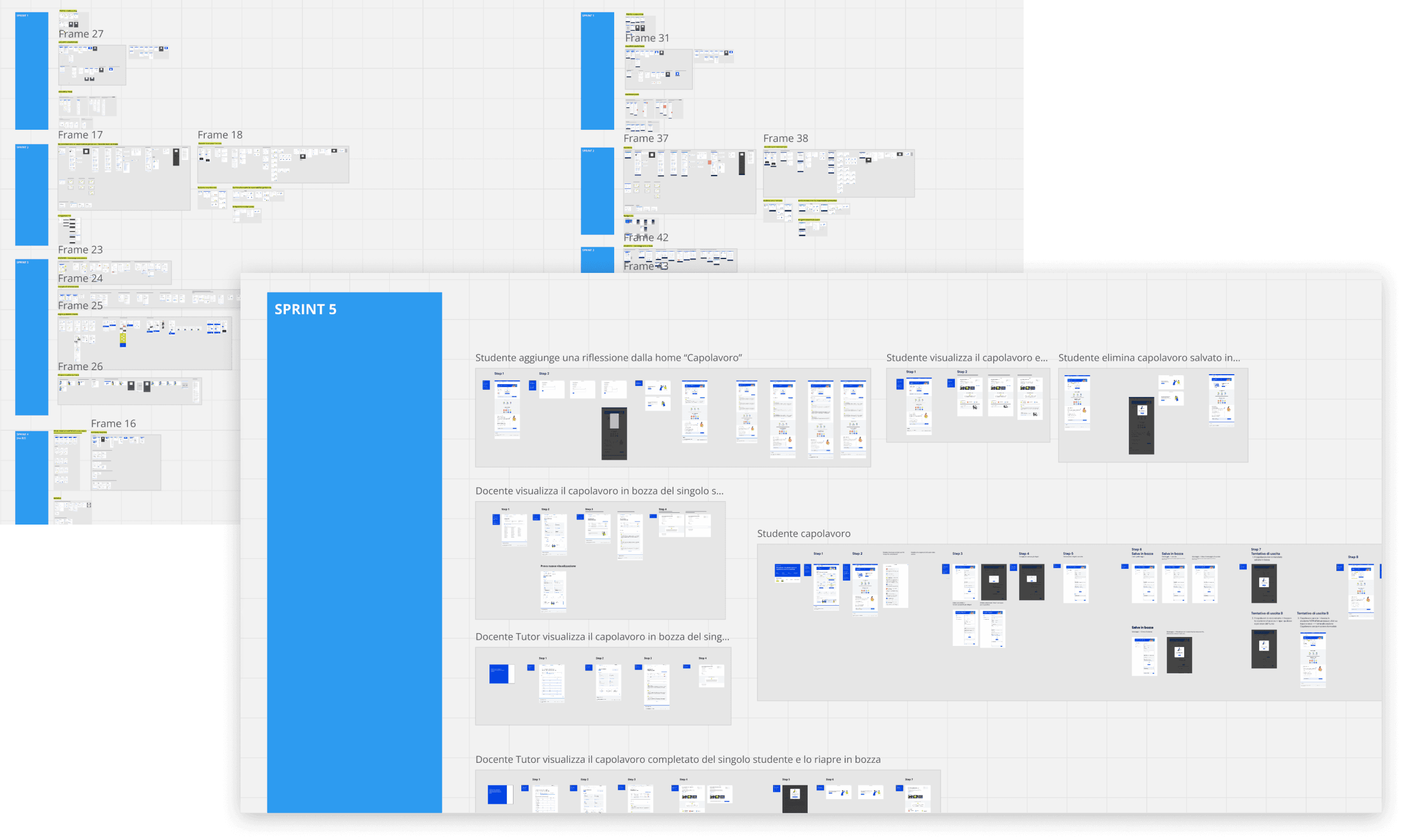
To further assist stakeholders in keeping track of all the designed pages and facilitate their reviews, we created a visual library on Miro.
The library hosts all the approved visuals, organized by sprints. This greatly helps everyone involved in the project maintain a clear overview.
Over 1 million applications for enrollment in the 2024/25 school year were submitted through the platform.
According to the integrated Customer Satisfaction survey:
- 93.9% of users appreciated the time saved
- 96.2% praised the service's efficiency
- 92.3% highlighted the ease of use of Unica
Ready to take your digital product to new heights?
Schedule your free 30-minute consultation right away!
Why reserve your spot now:
Receive instant feedback from a design expert with over 10 years of experience
Gain access to a network of specialized freelancers I regularly collaborate with
Join the consultation online via Google Meet, accessible from any location on your preferred device. Plus, it’s completely free!

